There are two things within our presentation that I feel could have been changed so that our audience could better understand our game. One would have been a comparison of the size of our main character to other objects, and the other would have been to play the actual music and sound effects that we would use in our game.
I would have like to compare the character's size to other objects because it would have captured the feeling of the character's struggle better. Without and reference, the audience can't understand the odds that our character must face to change himself back to his original size.
Showing the audience the soundtrack and sound effects would also have enabled them to understand the weight of the character's difficulties and triumphs. Without sound, video games would be extremely boring, especially when you are trying to tell a story.
I feel that goals are the hardest concepts to get across to an audience because depending on the story, there could be multiple goals and multiple motivations for reaching those goals. Without actually showing an audience a game, I feel that it is very hard to express goals unless you lay out the entire story, gameplay, rules, mechanics, and objectives of that game. Without doing so, the audience has no interest or reference as to how the character will achieve these goals and why he/she wants to achieve them.
Monday, May 30, 2011
Tuesday, May 17, 2011
Expo Extra Credit

This game is called Gull and you play as a seagull. I played it for about five minutes and what you do is fly through different shaped hoops and can poop on people. It definitely played better on the computer than the xbox though. It was really cool playing a game that students made in the same school that I am in.
Monday, May 9, 2011
Video Game Imagery
Bioshock Infinite Gameplay
I commented on the portion between 4:30-8:30 in the video.
Please pause the video at 5:54 and 7:35 because I comment specifically on those parts of the video. The reason I have done a separate audio commentary is because I don't know how to import youtube videos into imovie and change them.
I commented on the portion between 4:30-8:30 in the video.
Please pause the video at 5:54 and 7:35 because I comment specifically on those parts of the video. The reason I have done a separate audio commentary is because I don't know how to import youtube videos into imovie and change them.

Sunday, May 8, 2011
Reimagining Visual Framing
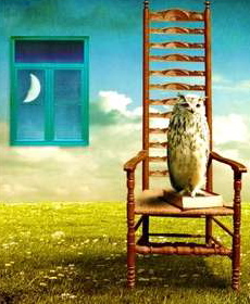
The reason I was drawn to this image by Ben Goossen is because I like the contrast and affinity of the wallpaper and the the window. They contrast because the wallpaper makes it look like day inside while we can tell by the moon in the window that it is nighttime. But there is also affinity because where the window is on the wallpaper is blue, the window pane is blue, and the sky is blue both inside and outside. Another contrast is that the owl which is nocturnal, is inside a room painted to look like day while it is nighttime outside. The reason I reframed this image is because it takes away the depth cues. In the original image, you can tell how far away the chair is from the window because of the lines that make this image look 3d. By taking away those depth cues, I made the image look very different. I feel that Ben Goossen framed this image this way because he wanted to use the space to make the owl seem trapped. By putting the owl in a chair, in a small square room that is painted to look like daytime, and with it being nighttime outside, he creates the sense that the owl is out of place and trapped. By zooming in on the image, I took away that sense of space and now you don’t get the feeling the that the owl is trapped in a small square room. In fact, you do not even know that the owl is in a room because you can’t see the walls or ceiling. Goossen did a very good job of using the rule of thirds and visual movement and rhythm. He place the owl, the chair, and the window at the intersecting points of the thirds. You fist look at the owl, then the chair, then the window. By doing this, at first you don’t recognize that it is nighttime and because of the wallpaper, it looks like day. Also, by making the chair be so tall and make it look like a ladder, it makes your eye go from the bottom of the chair to the back. Because it looks like a ladder, there is visual rhythm. It make your eye hop from step to step and makes the chair seem taller than it is. My zooming in on the image still holds the rule of thirds and doesn’t take away the visual rhythm of the chair.

Friday, May 6, 2011
Subscribe to:
Comments (Atom)